 This is a tutorial I originally wrote for Digital Art Masters: Vol.4 book. I hope you'll find it somehow useful or at least inspirational. So, lets begin...
My working process varies from painting to painting. Sometimes I start from a pencil sketch, other times I begin by mixing brushstrokes and searching for a nice composition that will tell me how to continue. I love experimenting, not knowing what will happen next, so I try many different things and see what works and what doesn't. I just try to keep in mind some basic rules of art theory, which will hopefully make the painting well balanced and easy to read.
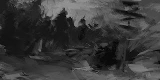
 In this case, I started by searching for a nice composition, before any story or characters were defined. I knew they will pop up eventually, so I just went with the flow, took some interesting brushes – as scattered and textured as possible – and created a bunch of abstract strokes (Fig.01). The first forms started to appear; some like figures, others like objects (a signpost for example), and a story quickly revealed itself in my head. A fierce army of undead creatures is marching to their final battle, but they get lost in their way... and where better to put Hell's lost army than into a freezing cold environment? A rough concept is made so I can go on, set an early color scheme, design some of the characters and see how everything works together.
 As the canvas size limited me on portraying a really huge army, I expanded it and got a lot of room for more soldiers on the left side, as well as some extra space on the right to show more of the environment they found themselfs in (Fig.02). In moments like this you really appreciate working digitally and not being limited to any number of changes. I also established the initial color scheme here in a rather cold blue hue, with some reds here and there to liven the whole image up a bit.
 With everything finally being roughly defined (the story, the composition, colors and so on) I switched back to grayscale mode and started adding the first details and designing my various characters (Fig.3). I generally switch between color and grayscale mode regulary, always checking if the painting works well both ways and if the depth is still readable. Too often it can happen that detailing with colors will lead into too many tonal variations and the image can become confusing.
 Being happy with the amount of details in grayscale mode, it was time to bring the previously selected colors back (Fig.4). This was easily done by dropping some color and overlay mode layers on top of the base image. I find overlay mode really useful: whilst coloring everything under it, it can also accent some of the highlights and darken the shadows, if needed.

 From here on it was mostly painting as I would do with acrylic colors – small brushstrokes to sculpt the characters out of the background, lots of detailing and polishing (Fig.5). While in this stage, I am always open to new things that might pop up in my head. So if at any stage of the process I feel a character doesn't fit in anymore, I delete it and paint another one from scratch, or I change the whole color scheme if the present one starts to get boring (Fig.6 - 7).
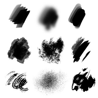
 In the rendering stage I like to make paintings vivid and »alive«, so I try to use saturated colors as much as I can, whilst being careful not to exaggerate and make it look »burnt«. To still keep things as real and believable as possible, regardless of the theme I am portraying, I do a lot of research and gather as many photographic references as I can. In this case, I was checking mostly for colors that snow could reflect, and found everything from blue, pink to orange hues – perfect for this type of illustration! I also prefer to leave lots of unfinished areas and raw brushstrokes in my paintings, especially those areas in the back where shapes are actually just hints of actual elements and left for the viewer's imagination to do the rest. To achieve that look, I use custom brushes (Fig.8), some of which are my own, and some I download from various artists' web pages. I would like to give credit here to the artists known as Goro, m@ and Barontieri for their brush packs, which I use most often and throughout all of my works.
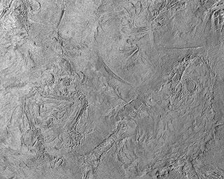
 At the end of every painting, when the rendering process is sort of finished (Fig.9), I start playing with textures and adding some of the last touches. For textures I often use different photos of rust and dirt, sometimes scanned acrylic brushstrokes, and overlay them on the painting. Every texture I place in is carefully chosen and refined on parts that don't enrich the basic image.
 Lately I've also experimented a lot with Photoshop's Bas Relief filter, which adds some sort of depth to brushstrokes (Fig.10). This filter, as well as texture layering, mustn't be overused, as it easily becomes cheesy if visible too much or shown on the wrong places.
 After texturing, it was time for those final touches, slight color corrections and last moment details, such as adding mist, dust particles and snowflakes – something which will tie the whole piece together and make it work as a whole, as well making it more believable (Fig.11).
The End :)
